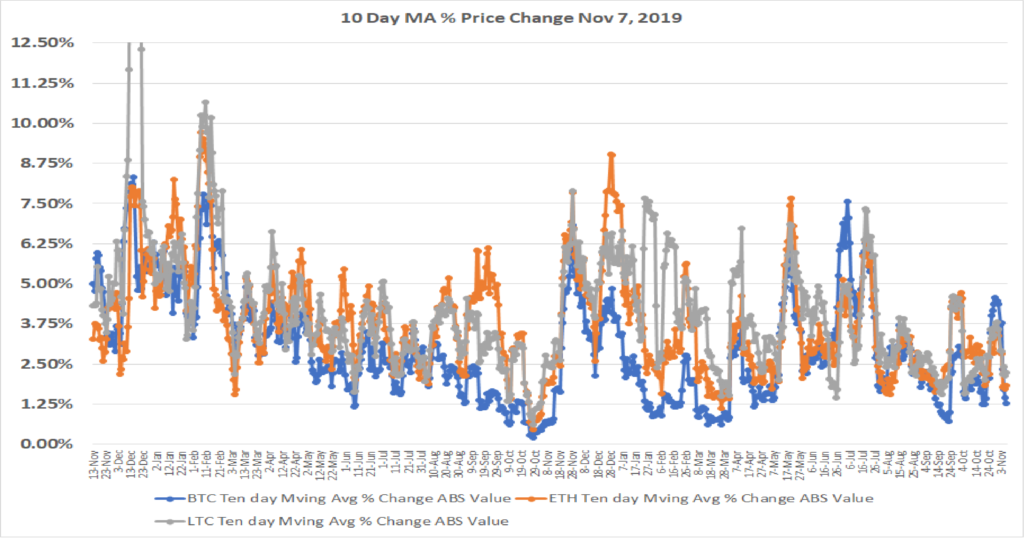
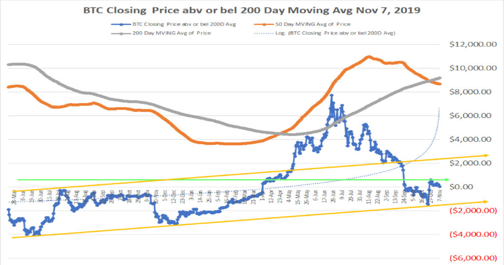
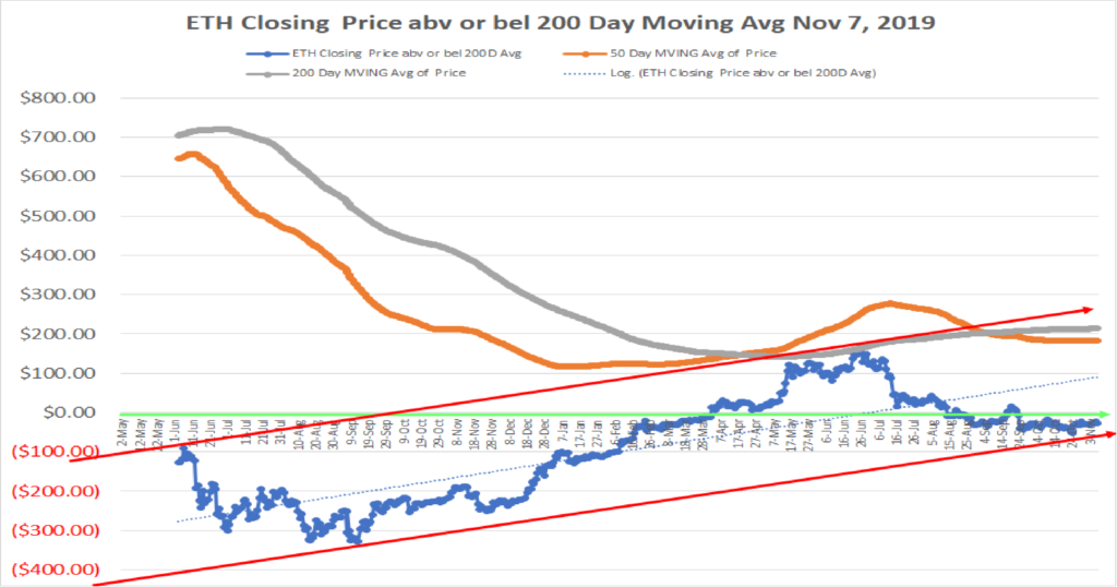
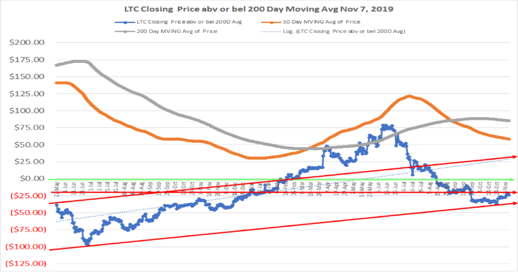
The named entities or Blockchains set forth below do not represent recommendations to purchase or in any way reflect investment advice. One of the key variables that is critical for deciding to invest is missing. That variable is the current valuation of each token or asset vs the overall market and a reasoned forecast of future performance vs the market. What is presented below attempts to inform and to encourage research, to learn about each, and to come to an opinion of whether any of them or all of them strike you as being an important participant in the future development of digital asset platforms. Charts of technical price levels and movements are presented to educate those unfamiliar with price patterns. These examples of real price activity show how prior price levels may be used to identify market points of price resistance or support. Use this information as you see fit, but it is recommended that you see this as an educational/informative tool only. This information is only part of the array of focus areas needed in making any investment decision, accordingly, it is best to not rely on one type of analysis for your capital allocation decisions.
A PDF version is attached for download purposes
A discussion of Custody & DeFi in a Blockchain World
August 2019
Custody and DeFi
By Thomas J Connolly
The Crypto Custody Marketplace in an emerging world of Digital/Crypto Assets
The nature of digital assets that require custody solutions is unique. These are not physical assets that you can hold in your hand or give to another from the wallet in your purse or pants pocket. These are bits and bytes, computer-enabled assets, that need protection from those that would steal them, or even from our own mistakes in making a keystroke error that would send these assets into the ether (no pun intended). Owners of Crypto-assets need to hold these assets in protected and secure repositories. For the individual this is often a custodial wallet (on an exchange), a non-custodial wallet (where the owner has the only keys that access the wallet), a hardware wallet (Trezor, Ledger, etc), or a cold wallet (keys stored completely off-line).
For the Institutional investor or Company treasurer, digital assets in the form of Crypto-assets cannot be kept in the more basic platforms that serve the retail consumer. Either required by regulation or by self-governed choice, the Institution or Company needs a more highly protected, insured, and safe environment to store the value they own in crypto-assets as they fulfill their fiduciary duty. As a result, new enterprises have emerged to provide this service.
Crypto-Custodians offer an enterprise-grade cold storage solution, fork management, asset insurance, multi-sig access, a user-friendly interface, and around the clock customer service. Some also offer Staking support (which is growing as more blockchain companies move to or begin life as a PoS platform).
In regard to cold-storage, the challenge has been to provide immediate access to customers/owners to their assets. Cold Storage solutions often require a day or more of pre-notice to the custodian. Xapo, one of the largest custodians before its acquisition by Coinbase, required a 2-day notice period to bring your keys online manually for you to make a transaction. This has been the typical delay for air-gapped cold storage, as the keys are kept off-line in cold-storage and need to be brought online to enable a transaction.
The development of Remote Automated Air Gap Security (“RAAS”) by Golidlock (patent pending), appears to be a game changer. Goldilock uses a combination of biometric gateways, one-time codes, two factor authentication, multi-signature security and encryption to make sure that only the owner of a particular vault can access stored data. Importantly, Goldilock uses a non-internet-based trigger, specifically the Public Switch Telephony Network (PSTN), to bring a vault online. Once the user has finished transacting, the vault will go back to being physically disconnected.
Today, the Institutional investor community is modestly involved in owning Crypto. Those that are invested in crypto-assets hold smallish positions (a study done by PwC indicated that there are 150 active crypto hedge funds with $1 billion in AUM). About 22% of institutional investors have purchased some crypto-assets, albeit relatively small positions. This compares to 40% who say they are open to crypto-investments over the next five years. This participation data is sourced from a survey released in May from Fidelity. More than 400 U.S. institutional investors were surveyed, including pension funds, family offices, cryptocurrency and traditional hedge funds, financial advisers and endowments.
A recent quote from Andrew Palmer, chief investment officer of the $52.7 billion Maryland State Retirement & Pension System, noted that at the moment the system doesn’t invest in any cryptocurrency funds. But he said, “We’d feel more comfortable with bigger custodians getting involved.”
The opportunity exists today, and once Institutions add Crypto to their portfolios, the size and importance of the Custodial provider will increase.
For those Institutional Investors and Companies that need the benefits of an Institutional Grade Custodian, the major providers of Crypto-Custody solutions include:
• BitGO
• Bakkt
• Fidelity Digital Assets
• Coinbase
• Gemini
• Kingdom Trust
• Xapo
• Vo1t
Within the group above, Xapo which at the time of this report had 700,000 BTC within its custodial platform (total assets under custody in excess of $7 billion) has been an acquisition target of Fidelity and Coinbase (Xapo subsequently agreed to be acquired by Coinbase). The acquisition price has been reported in the May 2019 timeframe to be in the $55 million range. As one of the largest custodians, the valuation points to modest current earnings from its custodial operations. The future storage needs will expand dramatically to the extent large Institutions add Crypto-currencies and assets to their portfolios, which will drive the desire of others to buy a company like Xapo.
Without discussing each of the above custodians, it is worthwhile to point out Kingdom Trust. Kingdom Trust serves both institutions and individuals. It has over $12 billion under management. It offers IRAs to the individual, including self-directed IRAs in Digital currencies. The breadth of their asset coverage, including real estate and precious metals, may position them very well for the advent of Security Tokens and the custodial services that will be needed as equities, real estate, art and other asset classes move to digital transactions and record-keeping of ownership on the blockchain.
Revenues to be generated from the custody services for institutional and company entities, including those enterprises that operate in the OTC markets vs the public exchanges, are typically based on a percentage fee on the value of the assets held. Coinbase, for example, charges 0.50 percent on the value of assets held. Coinbase had assets under custody of $1.3 billion. A 0.5 percent fee yields $6.5 million in annual revenue. It should be noted that Coinbase and Grayscale have just agreed to a custodial relationship where Grayscale will move $2.7 billion in assets from Xapo to Coinbase, and with the subsequent acquisition of Xapo, Coinbase has custody of over $7 billion in assets. Interestingly, Grayscale’s assets grew by $1.5 billion when compared to its AUM at March 31, 2019.
One final interesting Custodial platform is Vo1t. They operate a series of underground bunkers for cold storage. They recently partnered with Lendingblock, the securities lending exchange that was looking for what Vo1t describes as a “military-grade cold storage capability” for its institutional clients. Vo1t’s features include multiple layers of encryption of private keys, geographic distribution of private keys, thermal, vibration and motion detection, Faraday shielding to prevent against wireless infiltrations, 24/7 patrols and alarm monitoring with police response. Serving the Institutional investor community will become more competitive. Having the right assets and platform will be critical to winning a material share of the market.
As the financial world moves forward in accepting/adopting crypto-assets, the amount of assets in need of custody solutions will grow. The growth will likely be dramatic, particularly if equities and bonds advance and become part of the crypto-asset investment portfolio. There is a lesson to be learned here from looking at the U.S. equity and bond markets. This comparison is important as to the potential demand from the two sources and the decision as to whether to focus on one market (retail or Institutional) versus both markets. The retail owner’s needs are very different than the institutional owner’s needs, particularly in the frequency in which they transact (retail owners transact more frequently with shorter time horizons).
• In the U.S. equity market 34% of the market’s value is held by households. The U.S. equity market value is approx. $48 trillion (Global Equity mkt size is approx. $70 trillion according to the World Bank)
• In the U.S. bond market, 12% of the market’s value is held by households. The U.S. bond market value is approx. $44 trillion (Global Bond mkt size is in excess of $100 trillion according to the Bank of International Settlement)
Clearly, the Institutional investor will provide the largest demand in value to be stored. The retail investor will likely have less value to be stored in the aggregate.
Finally, the greater need for crypto custody solutions is occurring due to the ever-expanding and emerging New Finance and Banking industry. Why is there expansion? Because DeFi or Decentralized Finance is bringing the most important asset to the crypto asset world, its lifeblood, and that is liquidity.
DeFi is accelerating its growth into financial services
Deposit interest rates on fiat in a U.S. bank earn less than 1%. Sovereign bond rates in some of the largest markets in the world have negative interest rates. Equities are traded in whole units which excludes the small investor who wants to have equity ownership (93.3% of U.S. equities held by households are owned by only 20% of the population). This is compelling to those who want to build the finance platforms for the future in a world of crypto assets, fractionalized ownership and a greater dispersion of wealth.
DeFi is rapidly developing and creating an alternative to the traditional ways of raising capital, of consumer banking, of margin trading, of short-selling, of simply transacting in the world of today in anticipation of the world that is coming.
The above custody discussion revealed the size of the global equity and bond markets (close to $200 trillion). These are huge asset pools that will migrate to digitization and tokenization. The disintermediation of the middleman, the traditional financial institutions, is happening right in front of our eyes as new innovative products are being launched which are faster, cheaper, and more convenient than the existing products. The change will open the door to everyone who wants to invest in these asset pools.
In the world of banking the large financial institutions have been slow to embrace DLT and the blockchain. They have also lost touch with the retail banking sector, the sector that is most dominant in the crypto space. This has led to the development of NEO Banks which are preferred by millennials over traditional banks. They are 100% digital and reach their customers on mobile apps and personal computer platforms. Currently, there are 15 million Europeans using NeoBanks and that is forecast to grow to 85 million by 2023 (sourced from A.T. Kearny in their 2019 Retail Banking report).
As the banking relationship is changing, blockchain based companies are offering services that out-compete the historical financial institutions.
o Blockchain companies accepting crypto deposits are paying interest at rates significantly higher than fiat banks pay on fiat deposits. Interest rates on crypto deposits from 3% to 15% per annum are realizable today. For example, the Celsius platform accepts deposits and pays interest on seventeen different crypto assets. They launched in 2018 and have made over $2 billion in loans, have over $300 million in deposits, and over 40,000 wallets. (Please note that the writer of this article owns Celsius tokens). A quote from Celsius claims “ The average Celsian is earning over $400 annually on Crypto deposits, with over $3.7 million in interest income distributed to our community!”
o Blockchain companies are providing loans and margin loans to broaden out the financial offerings. Loans are available in stable coins that are easily convertible into fiat to assist fiat transactions, typically under $25,000. In the area of margin loans, DyDx is a platform that accepts deposits to earn interest, but more importantly enables users to deposit crypto as collateral for loans that are used to increase positions or to short the market. Credit/Collateral ratings for individuals are maintained and changes in that rating will adjust the margin requirement.
One of the key important aspects of this is that the above functions provide greater liquidity to the market. As of now, Bitcoin, Ether, etc., have not become transactional currencies for everyday use. They are more of a long-term hold (called HODLERs), and this ties up a great percentage of the supply, which decelerates innovation and market dynamics. The offering of attractive interest rates for deposits effectively stimulates the HODLER to deposit the tokens and from there the tokens value moves into the market to fund all types of activities through lending, thereby expanding the market for everyone.
A community aspect within the blockchain lending sphere is providing loans to small businesses, enterprises that often are shut out of traditional banking avenues due to their youth as a company or other limiting factors. A Global Credit Reputation blockchain DApp for small businesses is being introduced. The solution, created by the FintruX Network enables businesses to create a Trust Profile that showcases on-time payments, credit reviews and other useful insights about them, so as to access credit, secure payments, perform equipment/inventory financing, and negotiate mutually beneficial credit terms.
o The establishment of stable coins that are backed by collateral which enables a 1 to 1 matching with fiat (1 SC = $1) has been a significant development. It builds liquidity and attracts a different type of buyer that wants a stable valued crypto currency. This helps engage industry and provides finance solutions for those looking to hedge positions, leverage positions, and protect from market downturns. The blockchain company Compound, which pays interest rates on deposits of the token DAI (rates at the time of this report were 12.24% per annum), is one alternative in the market for earning interest on DAI. The creation of DAI occurs when a Collateralized Debt Position is entered into, depositing Ether in exchange for DAI. Today, there are 1,750,000 ETH ($400 million, see chart below) locked as collateral for finance transactions. Of that $400 million, 92% of the locked ETH resides on the Collateralized Debt Platform of MakerDAO, the entity behind DAI. This fuels the overall market and its continued development through the liquidity effects of adding capital to the system.
o Staking Services will expand as the number of platforms (blockchains, sidechains, DApps) move more to a PoS consensus vs a PoW consensus. Staking has become more popular with investors and Crypto token holders as a way to earn income in the form of the Staked Token. Enterprises have come into the market which track staking platforms and report on the best returns offered in the market. Other enterprises have emerged that will take on the responsibility of staking your tokens for a fee. Being able to perform staking services in the future will be an important addition to the DeFi company portfolio. This is particularly relevant as the Ethereum Blockchain is moving from PoW to PoS. A recent quote from an institutional player reflected the Staking opportunity: “If we want to stake a token like Qtum, it can take BitGo six months to provide support for that,” explained Jason Stone of Battlestar Capital. “That’s just far too long in a market that’s moving this quickly. I think if someone built an insured staking service that was a lot more proactive, there would be tens of millions of dollars’ worth of crypto moving into that business almost immediately. If they build it, we will come.”
o Payments and cross-border transactions using crypto currencies are improving rapidly. One of the most important features of Crypto-currencies is the ability to transact anywhere in the world. The speed of transactions on the blockchain is not fast today, particularly for processing immediate trades or transactions, however, the blockchain is still much faster than the global banking system for cross-border payments which typically take 3 or more days to settle, whereas the Ethereum and Bitcoin blockchains typically affirm a transaction in seconds to minutes.
o For cross-border transfers of value, the Blockchain is proving to be a money saver for those that need it most, ex-pats sending money back home. The last estimates of how much money is sent across borders to family members approximated $400 billion per year. The number of unbanked people in the world total 1.7 billion. The average fee for these transfers is 7.45%, with certain geographies significantly higher (north of 20%). That equates to $30 billion a year in fees. The average fee to transfer Crypto-currencies is significantly below that average rate, and this will bring a whole new segment of the population to the crypto asset class who will want lower fees.
o Another area to include here is the offering of Crypto based Prepaid cards for everyday merchant transactions anywhere in the world. Today, these represent partnerships with major credit card enterprises (VISA, UnionPay, etc). They often require a membership fee under a subscription plan that the blockchain based enterprise retains, as well as a percentage of the transaction value.
o Convertibility of one Crypto token into another crypto token is an important service to offer community members and those transacting with a DeFi service enterprise. Building a platform for this capability is one route to take, but in today’s market there are partners that can make that decision a simple one by using the partner’s platform to service your community. Kyber Network is a good example of a platform that sits atop many other enterprises’ wallets and finance offerings. It offers a seamless and fast exchange service (Note: The writer of this article owns tokens of Kyber Network, 0X, and Loopring). There are other platforms that enable this functionality and they include 0X (Zero X), Loopring, and a number of others.
o The development of Security Tokens is in its infancy. Being a part of this journey may prove to be a brilliant decision should the blockchain evolution result in all securities becoming tokenized. Investigating relationships with those enterprises that are building platforms to service the STO market should be assessed. Suggestions would include TZero, NOW, and Polymath to name a few (Note: The writer of this article owns tokens of NOW and Polymath).
Finally, Identity and reputation solutions are vital to the Custody and DeFi platforms. For security reasons, for incentive reasons, for fee-based decision making, for customer acceptance processes, and for regulatory filing requirements, the DeFi integration into the overall business/consumer custody and service platform is paramount.