March 27, 2020 best performers as of the close on March 26, 2020
Successful Strategies in a Dynamic World Covering Equities, Bitcoin and Crypto-Assets
March 27, 2020 best performers as of the close on March 26, 2020

My decision to sell into yesterday’s rally when the DJIA was up more than 1,000 points was based on fact. The underlying strength of the market on Wednesday was not supportive of the DJIA increase. Today, Thursday, has proven that decision to be wrong in terms of maximizing value as the DJIA is up an additional 1,352 points on this day, Thursday, March 26, 2020.
The selling I did yesterday moved me back to a 50% cash position, so I continued to benefit from the rise in the price of equities, but less so than I would have if I remained steadfast with the purchases I had made as the market (DJIA) traded some 3,000 points lower earlier in the week.
Managing the risk/reward relationship is a continuous process that demands constant attention. When the relationship feels as though it is out of balance based on the key metrics and news you have available, you must take action. Each decision we make should be viewed through the lens of learning: “Did my decision prove accurate? What occurred that informed me of the accuracy or inaccuracy of my action? Should I modify my tools that guide me in my decision process? Investing is always a learning experience, and we must invest the time and effort to study outcomes relative to the causes of those outcomes.
Back to today, I remain concerned that we will see a move lower that will retest the lows we hit earlier in the week. Why? My models have all moved back to neutral from the recent signal to buy. In some cases they have actually moved modestly into sell signal territory. In this more or less neutral state, I assess the magnitude of the fiscal and monetary actions taken, which are so significantly positive, vs the negative economic and health news that is expected to come over the next few weeks, coupled with my historic experience that when we have a disruptive event that dramatically increases risk and causes a repricing of equity and debt assets, that the bad news to come will be significant because the number of damaged companies/entities that were caught offsides, that were surprised by the event and suffered serious losses, have yet to disclose the damage, and when they do it will scare the market back to a retest of the lows.
The above view is simply my experience coupled with facts that make me cautious. The need to be observant and prudent with investment choices at this point in time is great, for the risk is high in this uncertain environment.
Be well! More thoughts, actions and reasoning will be forthcoming in the days and weeks to come.
All the best, and be safe,
Tom
I do not like the rally today in the stock market.
The DJIA is up over 1000 pts at 1:00 PM EST. My indicators are flashing yellow as the gain is not being validated by the 187 Portfolio. I am selling into this rally.
Follow-up: The market closed with a reversal of the day’s gains
reducing the 1,200 point gain to a 500 point gain. The warning signs for me were a few critical measures, the most important of which was lack of underlying support for the overall gain. After the close, with the DJIA up 495.64 points, the price change of the stocks within the 187 portfolio confirmed the weakness I noted during the mid-day. The cumulative price change of the 187 Portfolio was an increase of $22.27, or $.04 per DJIA point. This is incredibly weak. Look at my prior post where I noted the underlying strength that existed that was a set-up for the large rally we experienced. You can see that the change today was very small, too small for a market that gave many a feeling of improving opportunity. For me it was not an opportunity to buy, but was an opportunity to sell.
Be careful with your investing. Please also note that I may be entirely wrong and that my models may miss some variables that would refute my decision to sell today and lock in gains. That is the nature of markets, and why you should always strive for a sense of comfort with your ending positions when the market closes.
Dating back to 1990 I have maintained a Database of what I believe are the most important elements of the categories referred to in the title of this Post. I measure changes by year on a quarterly basis, but update this each week for new data releases. The summarized measures are reflected below, and they show positive changes in Interest rates, Money, and the Equity market, and negative changes in the economy and in Foreign Exchange.
I will be adding to this post during the next week, offering more detail of the underlying components of the main categories. I will additionally be posting my opinions and views on what this may mean in the context of the pandemic we are all facing. Stay home and be well.
One of the measures I look at is the day-to-day DJIA Index change vs the price change of the 187 Portfolio. The message here is positive as the magnitude of the 187 Portfolio change on down days is shrinking as compared to the magnitude of the change in the DJIA Index, and up days show a greater gain in the portfolio than the decline on down days. This reflects underlying currents that are potentially pointing to future positive strength as buyers are picking up/buying strong equities that have declined in a weak market. Consider the data below:
From March 16, 2020 the degree of decline on down days is less impactful than the days where we have market gains.
Consider the following:
DJIA point change on March 17, 2020 is an increase of 1,049 points. For the 187 Stock Portfolio, the dollar value of change was positive $1,100.76, or $1.12 per DJIA point change.
On March 18, 2020 the DJIA declined by 1,338 points. The 187 Portfolio dollar change was negative $996.91 or $0.75 per DJIA point change. Note the lower change of the 187 portfolio per DJIA point change between March 18 and March 17.
On March 19, 2020 the DJIA increased by 188 points. The 187 Portfolio dollar change was positive $375.85 or $2.00 per DJIA point change. Note the greater change of the 187 portfolio per DJIA point change between March 19 and March 17.
On March 20, 2020 the DJIA declined by 913 points. The 187 Portfolio dollar change was negative $712.37 or $0.78 per DJIA point change. Note the lower change of the 187 portfolio per DJIA point change between March 20 and March 17.
On March 23, 2020 as of 11:45 AM the DJIA declined by 950 points. The 187 Portfolio dollar change was negative $589.06 or $0.62 per DJIA point change. Note the lower change of the 187 portfolio per DJIA point change between March 23 and March 20.
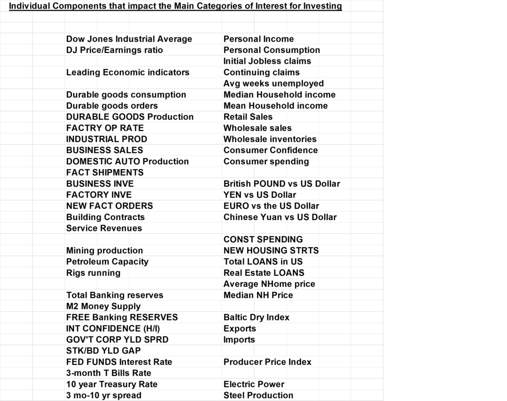
Tom Connolly’s Laboratory of U.S. data
These metrics show where there are positive and negative changes in key market moving segments of our economy.

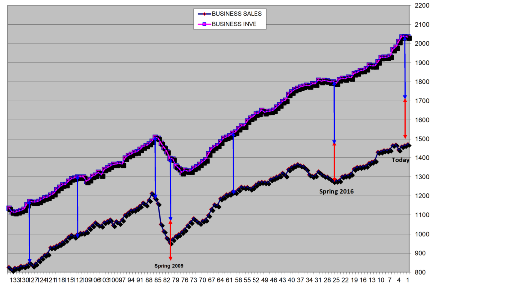
Business Sales as compared to Business Inventory
often lets us know when there is excess supply in the market. Excess supply is always present to a degree, but the current levels indicate a greater buffer zone that may accommodate impulse buys, unanticipated demand, or serve as a precursor to a slow-down in the economy. The chart below shows we have on an historical basis more inventory vs sales. This may, in our current shutdown environment, offer comfort that enough supply is there to meet demand at a time when factories are forced to be idle. Note the Blue and Red arrows. The Blue represents the normal gap between sales and inventory. The Red reveals the level of excess supply.
Business Sales v Inventory
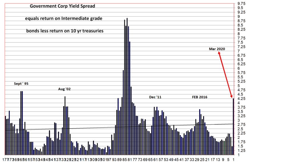
Different interest rates on corporate debt vs government debt
will often give us insight into how much risk there is in the market for loan defaults and economic difficulty to secure new financing. The chart below measures the spread or difference between the 10 year treasury bond and intermediate rated corporate debt. The peaks are all representative of periods when there was greater than normal risk in the market. As you can see, we have now exceeded or approximate the spreads for all past periods of great uncertainty other than the 2008-2009 financial crisis.
Government Corporate Yield Spread
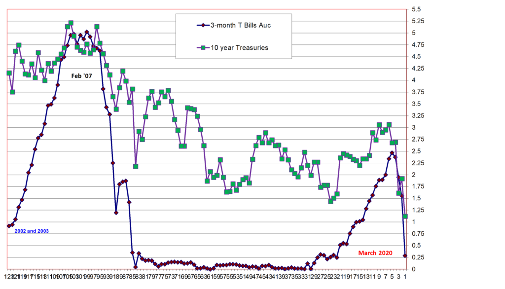
Interest rates on Three-month T-Bills vs 10 Year Treasury securities
over time give a view of monetary policy by the government and market demand for long-term fixed income securities. The chart below shows the dramatic change in yields this past week as the government takes action to provide the market with short-term liquidity at near zero cost, while also serving as a buyer of longer-term maturities. Compare the rates today to the rates that emerged during the 2008/09 financial crisis. Clearly the government agencies are doing everything possible to calm the markets during this unprecedented global health crisis.
3-month vs 10 year government securities
Two of the questions that I am sure are out there are: (1)why did I sell all of my equities at the end of 2019?; and (2) why did I start buying equities this week in the midst of the overall market selling in reaction to the health crisis?
There are more than one set of factors that caused me to buy certain equities in the midst of the decline, while still reserving enough cash to make me feel comfortable. Principally, stocks like Microsoft, as an example, were now on sale, yet they could go even lower. The sale price interested me, but I needed more to begin to be a buyer. In the data above it is clear that the gov’t is pulling out all the stops to try and insulate the economy and society from the financial impacts of the health crisis. Further, businesses have plenty of inventory to address a short-term cessation of operations. Additionally, money is inexpensive to borrow, and will remain so until the economy shows signs of coming back on-line.
Finally, on a more macro-basis, my 187 Portfolio has moved from sell-signals to buy signals. At the end of December 2019, they were giving me strong sell signals. Today, the buy signals are there, but they are not at historic buy levels. They may or may not get to those levels and the choice of waiting to see if they get there before buying or to gradually begin buying given the favorable zone they are in is the decision I have wrestled with. I finally made the decision to buy the best of the best at current levels, levels that are 25% to 50% below recent high prices.
Below are two of many charts that inform me when current market prices of stocks within the 187 Portfolio present buying opportunities.
Price to Cash Flow

Strength of buying or selling opportunity

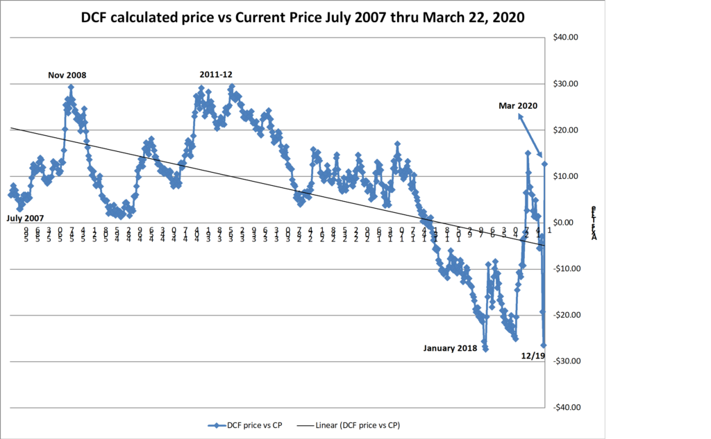
Another measure of value and investment timing that I look to is the comparison of a calculated price for each stock based on their future cash flow per share vs the current price.
The range of this calculated difference is +30 to -30. Positive differences are indications of value that are not appreciated by the market, while negative numbers are indications of an over-valued market where current prices are too high. Look at the chart below, and in particular the points and timeframes for the peaks and valleys. This is another example of why I sold in December 2019, and why I have started buying this past week.
Discounted Cash Flow of the 187 Portfolio vs the Current Price from 2007 through March 2020
The named entities and projects do not represent recommendations to buy or sell, or in any way intended to reflect investment advice. One of the key variables that is critical for deciding to invest is missing. That variable is a reasoned forecast of future asset performance vs the market. What is presented attempts to inform and to encourage research, to learn about each asset, and to come to an opinion of whether any of them or all of them strike you as being an important participant in the future development of asset platforms. Charts of technical price levels and movements are presented to educate those unfamiliar with price patterns. These examples of real price activity show how prior price levels may be used to identify market points of price resistance or support. Use this information as you see fit, but it is recommended that you see this as an educational/informative tool only. This information is only part of the array of focus areas needed in making any investment decision, accordingly, it is best to not rely on one type of analysis for your capital allocation decisions.
The past two weeks have been dramatic. Everyday I am monitoring the economy, the markets, and governmental actions. My sleep has been random, grabbing a few hours every now and then, as I think and assess where we are, where we have been, and where we may be going.
At the end of December 2019, I sold every equity except for the Gold Miners. Literally, I positioned my portfolio to be 100% liquid.
The changes in the financial and investment markets, driven by the global impact of a health crisis, have been dramatic. Declines in stock prices are in many cases breathtaking. Looking at my 187 portfolio model, the equities with minimal debt to market value, and which are in technology, healthcare, and media, are particularly interesting to me. Growth rates and strong operating margins are additional keys to focus on. Doing this, has led me to reposition my portfolio, effectively creating a balance between equities and crypto, with a continuing portfolio component of the Gold Miners plus 50% in cash.
Bitcoin and other Crypto assets have done admirably well at this point. They are clearly demonstrating Store of Value attributes, and warrant a place in every portfolio.
I will write more to help add clarity to you of how I am thinking and what I am doing.
The post I made on February 24, 2020 indicated that the DJIA would need to fall by another 5,000 points and the S&P would need to fall an additional 800 points to bring us back to their respective historic means. With the anticipated fall today, we will have roughly reached those initial targets.
This is a fearful and challenging time. The fear is one of personal individual health; the challenge is one of managing your assets in a way that minimizes losses.
Below is a chart of a measure I use to gauge the over-valued and under-valued states of the market. We have moved to a neutral position. This position exists with the earning and cash flow forecasts that existed prior to the determination that we have a pandemic situation that is seizing up commerce, trade, and growth (see my post from February 28, 2020). Factoring in the impact of the economic freeze on company operations, the market remains over-valued. This state is the current and longer-term condition IF the impact of the CoronaVirus lasts longer and is deeper than the two to three months of contagion and illness that appears to be the term experienced in Asia. There is great uncertainty, and at the moment the path of the virus is unknown. This feeds the economic and social dislocation.
With government action on a global scale, particularly if fiscal programs are put in place that are designed to stimulate economic growth, then the slow process of recovery is possible if we see improvement with addressing the virus. The most important key for an end to the economic freeze and to realize a positive change in psychology will be a better testing environment for the virus and a promising cocktail of a vaccine with effective therapeutic treatments.
I will continue to share my analysis as events move forward.
Stay healthy, be wise in your actions, and do not lose faith in the human spirit of creativity that brings about solutions that will bring us to a better place.
Equity Market State March 12, 2020

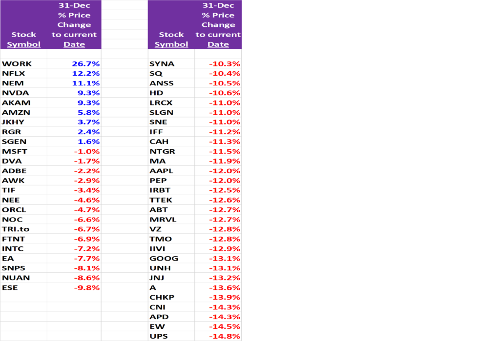
Stocks with the Largest declines in 2020
The listing below shows the equities within the 187 Portfolio that have declined the greatest since Dec 31, 2019. There are a number of metrics on the document, and the one I am highlighting today is the price decline.

Within the stock portfolio I maintain of 187 companies, I assess many dimensions of value. One of the measures is the calculated stock value based on discounted cash flows each company is projected to generate. The historic average of the number of companies out of the 187 that are over-valued based on a DCF assessment is 66 of the 187 companies. The troughs on the chart below are market bottoms, such as 2008/09 and 2011.
At December 31, 2019 the count of over-valued companies within the 187 companies stood at 97. With the recent market correction, the count is down to 77, moving closer to the historic average, but still above the market buying opportunities that history has shown occur at market bottoms.

This is a lesson of the importance of weighting the holdings within your portfolio to the most promising assets.
A simple measurement of change in value across the 93 crypto tokens I track, assuming a holding of one token for each asset, shows a Y-T-D gain of 33.20%.

The Radar Fund represents the same 93 tokens. Its performance is weighted by the different amounts invested in each token. The selection process channels more investment value into what is determined to be the most attractive assets. This differential approach yields a different Y-T-D return than the equally weighted portfolio.
The Radar Fund return Y-T-D as of March 1, 2020 is 45.07% vs the 33.20% of the 93 token market value.

The point of sharing this is to get you to think about portfolio allocation, to encourage you to invest the time to research each company and/or initiative, and to weight the precious investment money you have to those projects you believe in.
This is not a forecast of what will happen, but it is an attempt to make people think more deeply about the financial issues that could arise from the Coronavirus.
Why the 2008 financial crisis may very well be matched and exceeded by the pandemic nature of the Coronavirus.
Remember, the 2008 financial crisis was driven by over leverage, exotic debt and high risk derivatives.
Today, global debt is significantly higher than the total debt that existed in 2008. We unfortunately did not take steps to reduce that 2008 debt level.
The highly levered component of that overall debt, debt that carries very relaxed to no restrictive covenants, is very sensitive to company specific business activity. Should cash flow decline, the ability to service this relatively high interest rate debt becomes problematic. Compounding this potential problem is that the Highly Levered Debt currently on company balance sheets is at an historically high level. Potential defaults by the companies that issued this high interest rate debt would appear to warrant concern for the overall finance industry should a strong economic downturn take hold. Why?
Because the loss of economic value due to a global slowdown of trade and commerce from the pandemic will likely reduce liquidity in the financial markets as banks and others become reluctant to lend further. With economic contraction and the resulting negative impact on employment, the highly-levered loans that now exist in 2020 will be like the Liar Loans, the Collateralized debt instruments, and the derivatives of the 2005-2008 period. Repayment of the outstanding debts in accordance with the terms of the original loan agreements will show increasing signs of instability with the inability to comply. This would occur on a global scale.
Unfortunately, China and the Central Banks are not in the position to pick up the lost demand and re-ignite the financial markets as they did in 2008 – 2019.
It is very likely that the pandemic and its global economic and financial impact will be the catalyst that further moves people to seek out and adopt crypto currencies and crypto assets. Everyone looked for the “Killer” App to be the cause of mass adoption. Sadly, it may be a virus that shakes the foundations enough to drive purchases of alternative means of executing commerce and in storing value that are not based on our existing financial infrastructure.
Bitcoin, Ether and Gold look like interesting asset holdings to be considered for this possible period of instability and disruption.
Today we find the Dow Jones Industrial Average down by 1,000 points, the S&P 500 down by 119 points, and Bitcoin down by $400 per BTC. Why is this occurring?
The stock averages have been out of touch with reality for quite awhile. The valuation measures of Price to CashFlow are reflective of a Bubble. The measures of company Enterprise Value divided by Earnings Before Interest, Taxes and Depreciation/Amortization are at levels that defy historical standards. A return to the mean would result in an additional 25% decline in stock prices, or a further 5,000 point decline in the DJIA and an 800 point decline in the S&P 500. Stocks are and have been in a dangerous place compared to history.
The decline trigger has been the impact of the Corona-virus on psychology and on economic trade.
Why then has BTC declined to the extent it has?
Many high risk investors, those looking to leverage their positions to accelerate gains by buying on margin (taking out loans to buy stocks), need to generate cash to meet margin calls on their equity positions. I posit that these equity holders are also Crypto-asset holders, as the profile of high risk and high reward mindsets would likely see the same holders of both assets, stocks and crypto. In a stock market sell-off, the need to raise cash to pay back loans must come from somewhere or something. I think that something is Bitcoin, and that is why it is being sold-off today, to raise cash. Further, to the extent people have used loans or credit to buy Bitcoin, they also face margin calls on their crypto positions, and the potential for an accelerated decline in Bitcoin is real. If it occurs, I believe it will be an opportunity to reassess the entire asset market for under-valued or Baby out with the bathwater situations. Certain stocks and certain Crypto assets will be in that basket.
Stay Alert and informed.
Tom