April 22, 2020 .
The equity market, the gold market and the crypto market are in rally mode
Failed bounces off of lows should be in the front of every investor’s mind. I am watching closely. Off of the March 23rd low, we hit a high on April 17, 2020 in the 187 Portfolio. Comparing today’s and each day’s prices for each stock in the 187 Portfolio to the April 17th prices may give a sign of a failing rally or real animal spirits supporting a V shaped recovery. Right now, there are only a handful of stocks with prices at or above the April 17th prices. This has my attention.
For the day
Gold is up $48 per ounce or 2.8%. Stocks of the Gold Miners are higher, with Newmont Mining (NEM) hitting an all-time high.
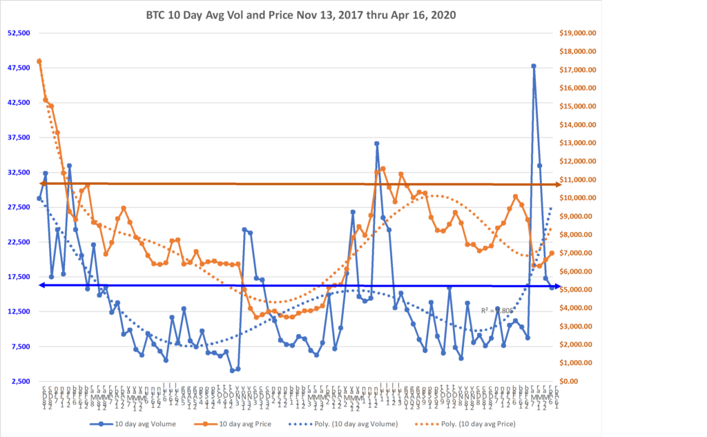
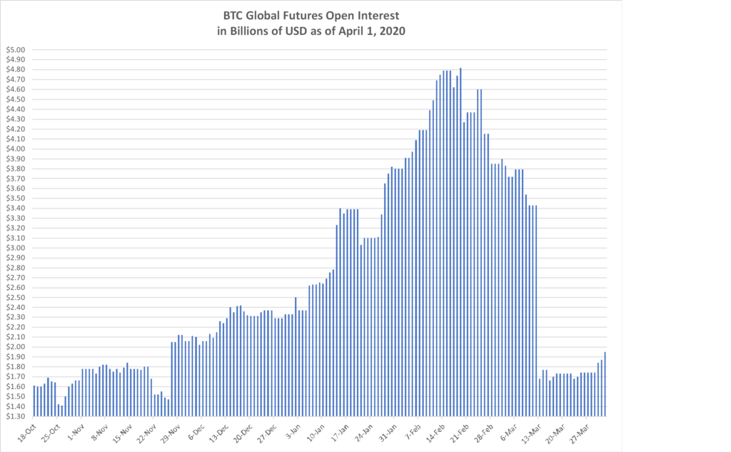
BTC is trading in the $7,100 area and needs to break resistance that I see at $7,400. If it clears that with some distance, say by $100 to $200, then $9,500 is the next point to get over.
Equities are showing strength, but I still do not trust this rally which is happening off of the latest stimulus from governments around the world. The 187 Portfolio is up 2.2%, while the DJIA and the S&P 500 are up 1.97% and 2.33%, respectively.
The Semi-Conductor stocks are rockin and rollin today. The heavy debt laden companies are the laggards.
- April 21, 2020
Watch out for the Margin Clerk today, as things get sold that holders do not want to sell.
Best performer today from the 187 Portfolio is FLIR, up 12.1%. Amazon is using thermal cameras in their warehouses.
Worst performer today from the 187 Portfolio is NBR, down 14.8%
The equity market may reset lower, and the question is how far? Typically there is an overshoot to the downside and the upside when capitulation occurs. How might the decline be measured and forecasted? Consider this:
Since 2007, for every dollar of levered cash flow generated by the 187 Portfolio, price growth has risen by 1.25X the growth in cash flow. Total Cash flow forecast for 2020 pre-Virus was $1,054.20 per share for the entire 187 Portfolio. If we reduce this by 20% to reflect the economic freeze impact on the year 2020, then we arrive at $843.62 per share. At a multiple of 22.59X, the price to cash flow multiple as of this morning, then the loss of $5,946.26 in projected share price would result in a projected decline of 25% in the market from today’s prices.
If we instead model based on 2021 projected cash flow of $1,072.85, pre-adjustment for the virus impact. Then the rate of growth in cash flow from the adjusted 2020 amount ($843.62) to the existing 2021 amount ($1,072.85), would be 27% Y-o-Y. As a point of reference, the compound annual growth rate in cash flow averaged over the past 12 years is 8.3%. The needed growth of 27% in 2021 over 2020 remains a challenge, and I anticipate a further equity price decline as the visibility to 2020 and revised projections of 2021 come to light at levels that may very well be less than what would be needed to support today’s equity prices.