Author: Thomas Connolly
Tom possesses a rich and diverse background that includes deep investing experience, senior corporate executive positions, and roles as a Regional Managing Partner and Global Industry Leader within Ernst & Young. He has advised executives on some of the largest acquisitions and dispositions in the Media and Entertainment industry, including clients such as Comcast, Citibank, Sony, Dalian Wanda and Publicis. Tom is a Certified Public Accountant with a Masters Degree from Columbia University. His skills are further accompanied by a personal passion for the study of economic trends and evolving market dynamics.
Current vs 90 day average of Crypto Mkt Cap
Midnight and Virtual
I was doing maintenance on my financial models and in removing some tokens, I created room for new companies. My research found Midnight and Virtual, symbols NIGHT and VIRTUAL,respectively, and I am intrigued.
I have begun building a position in these two assets
About Midnight
Midnight is a ground-breaking data protection blockchain. Developers can quickly, easily, and securely build regulation-friendly apps that safeguard personal and commercial data. https://midnight.network/
About Virtuals Protocol
VIRTUAL Protocol aligns incentives for the decentralized creation and monetization of AI personas for every virtual interaction (gaming, metaverses, online interactions, or beyond). https://www.virtuals.io/
A buy and sell indicator that we should not ignore.
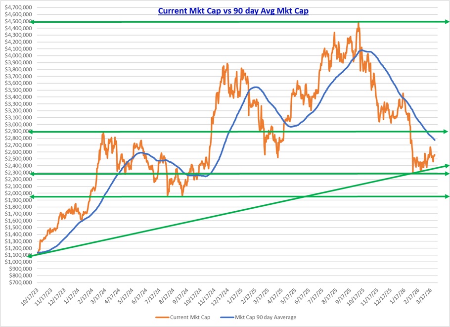
The total all-time crypto market high vs the low point over the past 90 days shows how large the gap is that a vibrant and investible market would be expected to gravitate to over time, whether that is a gap to be filled by a rising market or a declining market.
The all-time market high of $4.495 trillion was reached on October 6, 2025.
The chart below measures the magnitude of the risk and reward should the market sense their was too much enthusiasm or pessimism by market participants.
The prior all-time market high that gave a serious sell-alert occurred on December 6, 2024. The top at that time was $3.827 trillion vs the low point over the prior 90 days of $2 trillion. This gap of $1.8 trillion correlates to the December 2024 spread between the high and low marks listed here. It was signalling then that the smart move would be to begin lightening up positions and to enjoy taking profits.
Right now, we have the reverse. We are hitting new lows for the period over the past 90 days, and when compared to the All-time high that occurred in October 2025, the spread is dramatic and similar in magnitude to the December 2024 measure, but this time we have a sign to begin buying. Tough to buy now, as it is like catching that falling knife in a declining market, but if you want to buy low and sell high, you must weigh where we are in the market at any point in time and to choose wisely on what is safe given the risk you are willing to be exposed to. Good Luck!!

Well, this has not felt good
What a week! Kicked my Ass. Remember, do not use leverage to buy risky assets. Risky assets can provide above market returns but only if you can weather the storms. Weathering the storms means not getting margin called and being forced to liquidate your holdings. It is a shitty feeling.
So, what may I impart to you about this experience? First, I have two portfolios where I do use leverage. Weeks like this, occurring after I felt confident of a rally higher, saw me become fully levered with these portfolios. My bottom has been spanked on these two as I did get a margin call on one. So, what did I do in this environment?
First and foremost, I do not commit more cash to the underwater portfolio. I made a mistake in seeing a market primed for a rise when in fact it was getting ready to fall off a small cliff. Batting average is everything, so remember you will and I will be wrong at times. The question is what do you do when you are wrong? I sold down positions to meet the liquidity need as I treat each portfolio as a stand-alone that must survive on its existing assets with no throwing good money after bad. I sold some Bitcoin, but nothing else. Why? The multiple expansion of non-BTC assets at today’s prices feel to me that the outsized potential returns are within the Alt-coin market vs BTC. A very risky approach, but that is what this portfolio is about, high risk, high reward, high losses. Overall, I am not highly leveraged, but I do maintain distinct high risk strategy asset groupings to meet my goal of above market returns. Sometimes it works and sometimes it does not.
Remember, great declines and great surges higher are mostly transitory, and that is why you target buying low and selling high because the market is not static and will ultimately revert to the mean.
Keep the faith…
TJC
Foundations are educational as they are built

Where in the ALT coin world am I seeing the early shoots of higher investment interest?
Based on the crypto tokens I track, I wanted to see which one’s are leading the turn upwards. This is my first look under the hood this month to see which plugs are firing on time and in synchronization. The significant declines during 2025 may be ending as a bottom gets constructed. If that is what is happening, then this current valuation, given all of the positive regulatory progress, may be one of the best entry points for the high risk tolerant investor.


So how do my investments align with my vision of the future?
There is a curiosity I hear about the composition of my crypto asset holdings. What I have not heard is the question of how do my equity portfolios compliment my crypto portfolios?
The screenshots of three exchange portfolios that I manage are below. They are ordered by USD value from largest position to smallest position. This is all Crypto focused. The stock positions will follow. Stocks will reflect Crypto, AI and Precious metals.
Crypto Portfolio 1 
Crypto Portfolio 2 
Crypto Portfolio 3 
So the above reflects my crypto preferences. What about my equity ownership? Is it aligned with crypto? You tell me……..
Equity Portfolio 1 
Equity Portfolio 2 
Equity Portfolio 3 
Market breadth should ratify a sustainable move led by BTC and ETH
There is value to looking at the Crypto mkt without the impact of price changes in BTC and ETH. The expectation is that overall market strength should reveal itself if the price movement is broad and has legs that are sustainable.
What does this chart tell you?

Trend remains in place
